Enhancing the search experience on higher education websites
A seamless search experience is vital for a higher education website. It offers the website’s very different users a way to sift through masses of information and find what they're looking for quickly and efficiently.
Universities and colleges have rapidly adopted digitalisation in recent years. This shift to digitalisation happened organically as these institutions needed to keep up with trends and technology. But the transition was accelerated by the Covid-19 pandemic, which required a very quick shift from in-person to online learning.
Although digital transformation has been a priority, there is one vital element of higher education websites that is often overlooked – website search functionality. This is despite research showing that providing an excellent search experience can have a significant impact on student enrolment and satisfaction.
Today’s students have grown up with technology and expect websites to provide a great search experience, one that rivals Google or Bing. Yet many universities still provide dull, unhelpful course listings that are simply lists of courses grouped by faculty or A-Z lists with no search functionality, metadata or imagery.
This reflects poorly on institutions that should be leading the way when it comes to fresh thinking and learning. Universities don’t just need to keep up with global standards – they should be setting them.
Why is a good search experience needed?
According to the 2023 E-Expectations Trend Report, almost half of all high school students use the site search to navigate a website. Therefore, having a site search on a website is not just something that students find helpful, it is something that your prospective students expect.
A well-designed search experience on higher education websites can yield numerous benefits.
Information for users
It helps users easily navigate through the wealth of information typically available on higher education websites, such as courses, clubs and extracurricular activities, research projects, and campus details.
This plays a huge role in the decision-making process of prospective students, who rely heavily on websites to gather information about potential universities or colleges.
The disconnection between users’ expectations and what is available can be a cause of much frustration for users. For example, users may expect the information they’re looking for to be in a different section of the website.
Research from the NN Group found that nearly half of the visitors to university sites didn’t realise that the university offered the programme that they were looking for. One reason for this was because prospective students didn’t know which degrees belonged to which school.
“Prospective students look for majors and programmes, not schools or colleges. In our research, a staggering 48% of users didn’t realise that the university offered the programme that they were looking for even when it did. When they didn’t find a programme where they expected it to be, they assumed it simply wasn’t offered.”
– NN Group researchers
As a result, a poor search experience may lead to frustration and disengagement, potentially causing them to go elsewhere when they can’t find the information they’re looking for.
Information for institutes
Combining a seamless search experience with search term analytics can also provide valuable insights into user behaviour and preferences, enabling institutes to optimise their content according to what users are looking for.
Analytics can identify the most popular searches of a website. They can also identify gaps in content, as well as the content that is viewed the most. This helps show what content is the most important to users.
Analytics can also give an overview of how the website is performing and where changes can be made. This can be done by analysing click volume and click-through rate.
Challenging factors
University websites are complex. They serve a dynamic, complicated audience made up of various types of users. And because the users are so diverse, so too is the content.
Multiple audiences
Universities and colleges tend to have multiple user personas that they are trying to provide information for. This includes prospective students and parents, current students, staff, and partner research institutions and businesses.
The information that all these different audiences require can vary substantially. For example prospective students typically look for course information, campus life details, and other supports available to them, while current students may be looking for course timetable information or details about upcoming events.
Vast and varied content
As outlined above, university and college websites contain an abundance of diverse content from degree details to staff profiles, from news and events to research projects and campus information. Without an effective search function to navigate through this content, users may get lost and become frustrated.
Bear in mind that 70% of Gen Z users expect websites to know what they are searching for before they even enter any information. They also expect the search function to behave like the familiar Google Search with relevant information at the top of the search results.
Approaches for developing a high-quality search experience
When developing a higher education institute website, several factors should be considered to ensure a high-quality search experience.
1. Prominent search functionality
Users won’t spend much of their time looking for information they could probably find elsewhere. The general average time spent on a website is just 53 seconds!
And researchers found that people only spend about 2.6 seconds scanning a website before focusing on a particular section. In other words, they need to find that search function quickly.
Because search functions are so important to higher education institutes, they need to be prominent so that users can find them easily.
We recommend that there are separate course and site searches. This allows more advanced search filters for courses (primary search use case) while not over complicating site search (although some filters such as on type of content can be useful here too).
We also recommend that a search bar be placed in a header that is easily accessible from every page on the site.
The course search should be placed in a prominent position above the fold (in hero area) on the home page. Eye-tracking studies show that 80% of users’ viewing time is spent in this area.
This was the approach we took with both the Galway Mayo Institute of Technology (GMIT) website and the Atlantic Technological University (ATU) websites.
Although the GMIT website was visited by an extremely broad range of users, research showed that prospective students were the dominant group.
The primary goal of all these prospective students remained the same – to research courses that interested them to make a positive change to their future. With this front-of-mind, the focus was on creating a simple, intuitive course search.
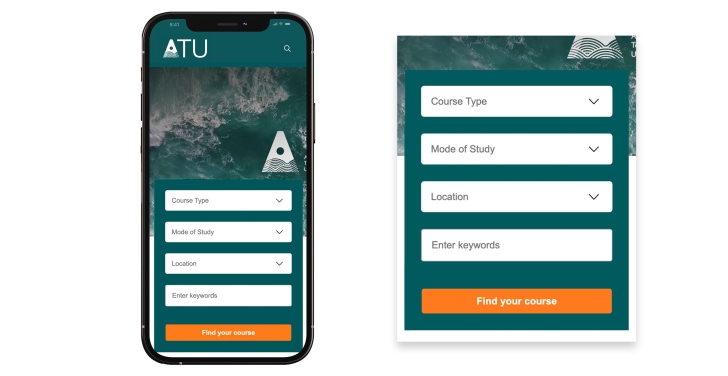
The course search is above the fold on the GMIT website, and immediately offers users simple filtering options.
While a range of possible filters are available to use for filtering courses, a simple text search on the homepage will avoid creating any type of barrier to users. We used this simple text search on the ATU website, which allowed us to funnel users towards the richer Course Search page where they can interact at a more detailed level.
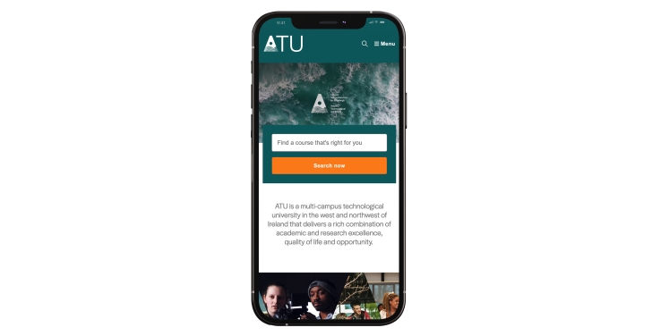
The course search on the ATU website is also prominent. However this one is presented as a simple keyword search. Clicking on the search button takes the user to a course search page that offers more filtering options, such as course type, mode of study, method of delivery and campus.
Allow users to find the courses they want, how they want
One of the more interesting findings from the original research done by GMIT was that while all key user groups were ultimately researching courses, they expect to be able to find them using different angles that are most important to them.
A simple example of this is that mature students are often more restricted in terms of the location in which they can study, while students applying through the CAO from the school system are much more interested in the experience.
By allowing for filtering by main areas (Course Type, Mode of Study and Location) users can filter the vast course information by what’s important to their own decision-making process. Each course needs to contain a lot of information.
By simplifying crucial information on the splash page for each course, prospective students can now easily scan and compare courses.
For GMIT we used a tabbed approach for course content. This ensured we could present the information in the order we would expect a prospective student to need it, and also display the broad range of course information in easily digestible topics.
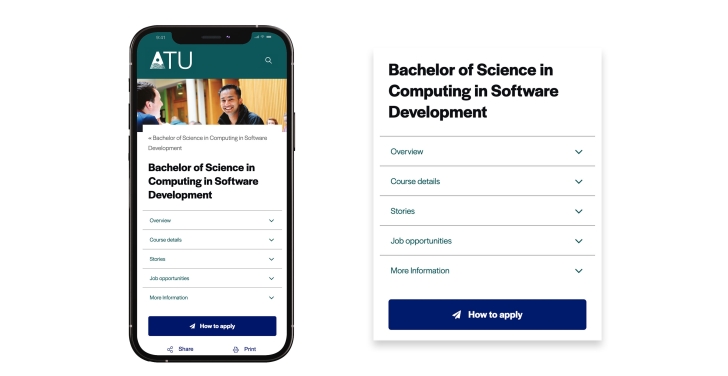
The tabbed approach allows GMIT to present a lot of course information in digestible chunks.
2. Advanced search features
Advanced search features, such as autocomplete suggestions, filters and sorting options, are particularly important in the course search.
Autocomplete
Having autocomplete suggestions built into your website’s search functions saves the user time and effort.
The autocomplete suggestions refine the search list as users type to make it as easy as possible for them.
Filters
The Qualifax.ie website also has a nice feature for scrolling through its filters. Here some of the multiple-choice options numbered in the hundreds (e.g. “course provider”) so only 10 or so are visible at any one time. You can scroll through the options, or scroll past the options to the next search filter.
Qualifax.ie had so many search fields, that we decided to display the primary search fields first, and then hide the rest behind an ‘advanced filters’ button, which when clicked expands to show the additional filters for users who are quite specific in what they are looking for.
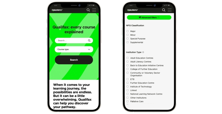
Advanced research filters on Qualifax's website allow users to filter by NFQ classification, institution type, district and province.
Boosting or weighting of results
When searching content on a site, a relevancy score is calculated based on the number of times that the search terms entered appear in the content. When working based on the keyword frequency alone, it is possible for older content to appear at the top simply because it is richer in those keywords than newer content.
This is where using search product that supports result weighting (we really like Apache Solr) is beneficial. It allows you to boost certain results higher. This simply means that an extra weight is added to the calculated relevancy score. This allows you to increase the score of a search result because of the type of content it is (e.g. landing page vs a news article), or because the keyword appears in the title of the page, etc. If you need guidance in this area, we can work with you to determine the boosting rules required and the type of content that should be promoted and when.
Search snippet highlighting
In addition to the boosting and weighting of results, the inclusion of a search result snippet which contains the search term highlighted can help combat the apparent randomness of the search results. This may be appropriate to use in the site-wide search results, but may not be desired in filterable listings such as a find-a-course listing where a table listing showing key information may be more appropriate.
Sorting options
As described above, the boosting of search results is possible so as to promote higher priority content to the top of the results and demote others. In this scenario you are still sorting the results by relevancy. However, sometimes the user may wish to not sort by relevancy, but rather by date or reverse date order. Allowing the user to toggle between different sorting options can be helpful.
3. Improve metadata and keywords
The metadata and keywords fields are built into the back end of the CMS. They allow content managers to highlight those phrases and words that are most relevant to users so that search engines (for both browsers and internal websites) can pick them up.
There are a few things that can help optimise the use of metadata and keywords:
Structure
Ensure content is well structured (good IA and structured content) to support easier filtering. Ensure relevant keywords are in the content, and use (often hidden) metadata fields to boost relevance. The hidden metadata fields can also be used to cover synonyms or common misspellings.
Don’t rush
This function can often be overlooked, especially when the team is hurtling towards a deadline. Take time to optimise search results. If the search function gives you the option to boost a particular type of content in the results, use it. You could, for example, boost matching content, or boost content if the keyword appears in the title rather than the body text
4. Search analytics
You can’t make improvements to your search function if you can’t measure it. We advise clients to integrate the search with an analytics tool such as Google Analytics or Matomo so that all search terms entered are logged and can be analysed later.
Just bear in mind that this will only be possible for users who have accepted statistics cookies on the website.
Ideally capture data such as search keywords, total number of searches, searches with clicks, click-through rates, average search position. This will help you to ensure that your search function is optimised so that users have to do as little work as possible to find the information they need.
Optimising the search experience on higher education websites is an ongoing process that requires continuous monitoring and refinement. We recommend that universities and colleges regularly review search analytics data, gather user feedback, conduct usability testing, and implement enhancements based on best practices and industry trends.
Once you understand your users and what they’re searching for you can provide more relevant content (so writing it in the first place) and optimise the search results based on your learnings from the search analytics By staying proactive and responsive to user needs, you can ensure that your website's search functionality remains efficient, user-friendly, and impactful.
5. Mobile experience
Optimisation for mobile devices is imperative. Statista reports that, in January 2024, mobile devices, excluding tablets, accounted for nearly 60 percent of web page views worldwide.
Suffice to say, search functionality needs to be optimised for mobile devices, and ease-of-use and mobile-friendliness are key. This is particularly important if there are a lot of search filters and search options that can be applied.
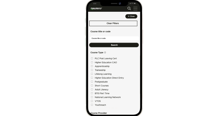
Take for example the Qualifax.ie course search, which has 12 filter fields. Scrolling past all of these search fields just to get to the results would be tedious and not an enjoyable user experience. For this reason, on the initial pageload the search fields and filters are hidden as shown below.
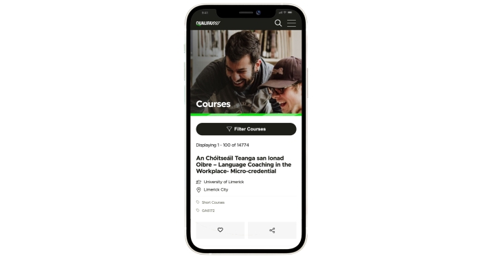
And there is a ‘Filter Courses’ button. When this button is clicked, the search filters are expanded as shown below:
Conclusion
A good search experience is a fundamental component of higher education websites. By prioritising the development and optimisation of search functionality, institutes can enhance user satisfaction, engagement, and conversion rates.
It is essential for higher education institutes to invest in robust search features, monitor performance metrics, and continually refine the search experience to meet the evolving needs of users.
Ultimately, a high-quality search experience can set an institute apart from its competitors and create a lasting impression on its target audience.
Is your search function helping or hindering your users?
An efficient search experience can be the making or breaking point of your entire website. We can help you get the best out of your site’s search functions.

Stella Power Managing Director
As well as being the founder and managing director of Annertech, Stella is one of the best known Drupal contributors in the world.

